Branding
Herb & Earth
Full brand redesign for a wellness company entering the UK market — logo, packaging and guidelines built to feel credible on a shelf next to established brands.

Deliverables
Logo, packaging & guidelines
Market
UK wellness retail
The Challenge
Herb & Earth was entering the UK wellness market without an established visual identity. The brand needed to look credible next to competitors already sitting on shelves — trustworthy enough for a first-time buyer to pick it up, without losing the warmth that wellness shoppers respond to.
The Approach
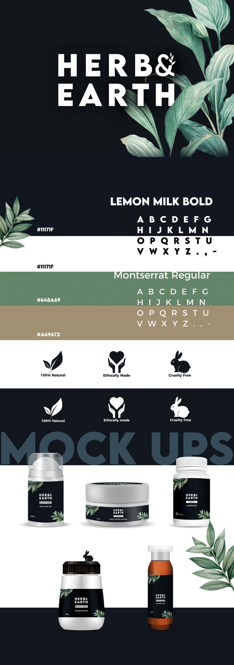
We built the identity from the ground up: a logo system that works at packaging scale, a colour and typography palette rooted in natural, earthy tones, and full brand guidelines so the look stays consistent across every future product line and marketing touchpoint.
The Outcome
The result is a shelf-ready identity system — logo, packaging and a documented guideline set — giving Herb & Earth a consistent, trustworthy presence as it launches into UK retail.